Welcome! This is the Studio Feixen Fonts Wiki. Here you can find everything about how to use alternates ↓ and ligatures ↓ or embedding ↓ and animating ↓ fonts. Discover the ⟮hidden⟯ features of our fonts and learn how to activate them.
Specific
About Studio Feixen Fonts
Studio Feixen Fonts started in 2020 with the publication of the Studio Feixen Sans, the corporate typeface originally designed for Studio Feixen. What started as an experiment quickly evolved into a full-fledged type foundry, now working with clients around the world. Studio Feixen Fonts has approached type design with the same mindset that shaped the studio’s design work: questioning conventions, exploring new territory, and pushing boundaries. Each typeface is developed as a complex tool, not only to solve everyday design challenges, but to open up new ways of working with type.

Felix Pfäffli
Co-Founder, Designer
Felix Pfäffli is a Swiss graphic designer and founder of Studio Feixen, established in 2009 in Lucerne. Known for its bold and experimental work across graphic, motion, and spatial design, the studio has gained international recognition. In 2020, he co-founded Studio Feixen Fonts with Robin Eberwein to explore type design with the same playful and precise approach. He teaches at the Fachklasse Grafik Luzern, and regularly lectures at conferences and institutions worldwide.

Robin Eberwein
Co-Founder, Designer
Robin started his collaboration with Felix during an internship at Studio Feixen in 2019. In the same year, he was awarded the Design Prize Switzerland and joined a design residency in San Francisco. One year later, he co-founded Studio Feixen Fonts together with Felix Pfäffli. He lives and works in Lugano and regularly travels to Asia, with Seoul and Tokyo as key hubs. He has lectured at the renowned typography school PaTI in Seoul and teached at SUPSI and ZHdK.
License System
License System:

(Computers)
(Monthly Visitors)
Our licenses are based on two variables: The number of computers on which the font software will be installed and used, and the number of monthly visitors that your websites, apps, social media campaigns, web ads, newsletters count in total. You can choose your license package by selecting the appropriate level during the checkout process.
License Levels*:
| Desktop License: | Web License: | |
|---|---|---|
| Level 1 | 1-5 Computers | 50K Monthly Visitors |
| Level 2 | 6-10 Computers | 100K Monthly Visitors |
| Level 3 | 11-20 Computers | 200K Monthly Visitors |
| Level 4 | 21-50 Computers | 500K Monthly Visitors |
| Level 5 | 51-100 Computers | 1 Million Monthly Visitors |
| Level 6 | 101-500 Computers | 5 Million Monthly Visitors |
| Level 7 | 501-1000 Computers | 10 Million Monthly Visitors |
| Enterprise License** | Unlimited | Unlimited |
*Our licenses are available only as a package, which includes both Desktop and Web licenses at the same time. The two licenses cannot be purchased separately.
** Please get in touch for a quote.
Desktop License (Computers):
This License allows you to Install the font on your Mac OS X or Windows system Use the font within desktop applications such as Microsoft Word, Mac Pages, Adobe InDesign, Adobe Photoshop, etc. Create logos/trademarks, design and print documents, as well as static images (.jpeg, .tiff, .png). The Desktop license is based on the number of users of the fonts (Computers).
Web License (Monthly Visitors):
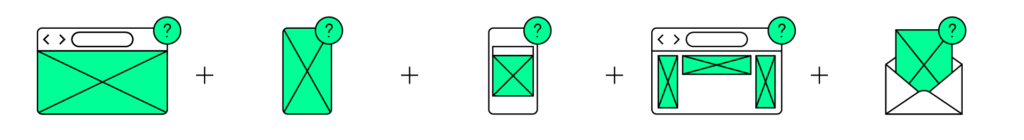
App(s)
Social Media
Web Ad(s)
Newsletter(s)
This license is based on the number of monthly visitors that your websites, apps, social media campaigns, web ads, newsletters count in total. It allows you to use the font on your websites, apps, social media campaigns, web ads and newsletters. You can install the font on your server and embed it in your website or app.
Adding users later:
Our licenses are cumulative. If you require additional users to be covered under your license, you can easily upgrade by placing a new order for the same font with the desired additional desktop and web licenses.
EULA
If you want to use our fonts, you must accept the Studio Feixen Fonts End User License Agreement (EULA). In this document, you will learn about the terms and conditions for using our fonts, including the different types of licenses available and their specific usage restrictions.
Noi Grotesk
Noi Grotesk
Noi Grotesk is a neo-grotesk family inspired by the swiss traditions of typography with a more contemporary and friendly touch. Thanks to its many features and alternates Noi is surprisingly versatile.
OpenType Alternates
| Stilistic Sets ? | What? | Why? |
|---|---|---|
| ss01 | Single Storey a | More childish Feeling |
| ss02 | No-Tail a | More serious Feeling |
| ss03 | Alternate y | More serious Feeling |
| ss04 | Creamy f,t | Extra Style in Headlines |
| ss05 | Creamy Alternates | Extra Style in Headlines |
| ss06 | Small Size Numbers | Ensure Readability |
| ss07 | Thinner Punctuation | Extra Style in Headlines |
| ss08 | Square Dots | More serious Feeling |
| ss09 | Headline Letters | Reduce Vertical Space |
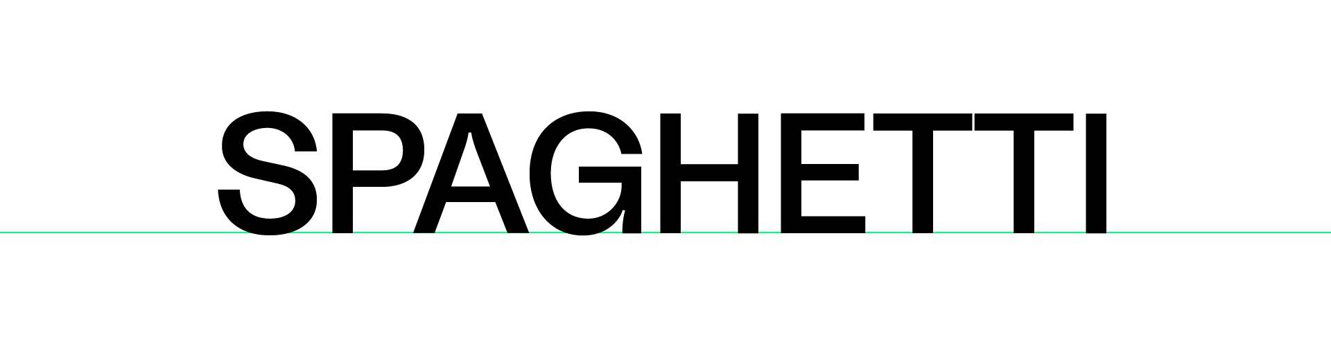
| ss10 | Spaghetti Alternates | For F.U.N. |
| ss11 | Alternate & | More normal Feeling |
| ss12 | Double Storey g | More serious Feeling |
| ss13 | Alternate Greek phi | More serious Feeling |


OpenType Features
| Figures ? | Included? | Why? |
|---|---|---|
| Oldstyle Figures | Yes | Blend in better in Text. |
| Tabular Figures | Yes | Align Numbers vertically. |
| Tabular Oldstyle Figures | Yes | Align Numbers vertically. |
| Caps Figures | Yes | For All-capital Headlines |
| Slashed Zero | Yes | Avoid confusion with the letter «O» |

| Other Features | Included? | Why? |
|---|---|---|
| Fractions | Yes | Automatic Fractions |
| Superscript | Yes | Above the Line |
| Subscript | Yes | Below the Line |
| Contextual Alternates | Yes | Various Reasons |
| Case Sensitive Forms | Yes | For All-capital Headlines |


Variable Settings
| Font Weight | ‘wght’ (Weight) | ‘ital’ (Italic = 10) |
|---|---|---|
| Black | 900 | 0 – 10 |
| Bold | 750 | 0 – 10 |
| Semibold | 600 | 0 – 10 |
| Medium | 500 | 0 – 10 |
| Regular | 400 | 0 – 10 |
| Light | 300 | 0 – 10 |
| Ultralight | 200 | 0 – 10 |
| Thin | 100 | 0 – 10 |
Languages Supported:
Latin: Abenaki, Afaan, Afar, Afrikaans, Albanian, Alsatian, Amis, Anuta, Aragonese, Aranese, Aromanian, Arrernte, Arvanitic, Asturian, Atayal, Aymara, Azerbaijani, Basque, Bemba, Bikol, Bislama, Breton, Cape Verdean Creole, Catalan, Cebuano, Chamorro, Chavacano, Chichewa, Chickasaw, Cimbrian, Cof n, Cornish, Corsican, Creek, Crimean, Tatar, Croatian, Czech, Danish, Dawan, Delaware, Dholuo, Drehu, Dutch, English, Esperanto, Estonian, Faroese, Fijian, Filipino, Finnish, Folkspraak, French, Frisian, Friulian, Gagauz, Galician, Ganda, Genoese, German, Gikuyu, Gooniyandi, Greenlandic, Guadeloupean Creole, Gwich’in, Haitian Creole, Hän, Hawaiian, Hiligaynon, Hopi, Hotcąk, Hungarian, Icelandic, Ido, Igbo, Ilocano, Indonesian, Irish, Istro-Romanian, Italian, Jamaican, Javanese, Jèrriais, Kaingang, Kala Lagaw Ya, Kapampangan, Kaqchikel, Kashubian, Kikongo, Kinyarwanda, Kiribati, Kirundi, Kurdish, Ladin, Latin, Latvian, Lithuanian, Lombard, Low Saxon, Luxembourgish, Maasai, Makhuwa, Malay, Maltese, Manx, Māori, Marquesan, Megleno-Romanian, Meriam Mir, Mirandese, Mohawk, Moldovan, Montagnais, Montenegrin, Murrinh-Patha, Nagamese Creole, Nahuatl, Ndebele, Neapolitan, Niuean, Noongar, Norwegian, Occitan, Old Icelandic, Old Norse, Oshiwambo, Palauan, Papiamento, Piedmontese, Polish, Portuguese, Q’eqchi’, Quechua, Rarotongan, Romanian, Romansh, Rotokas, Inari Sami, Lule Sami, Northern Sami, Southern Sami, Samoan, Sango, Saramaccan, Sardinian, Scottish Gaelic, Seri, Seychellois Creole, Shawnee, Shona, Sicilian, Silesian, Slovak, Slovenian, Somali, Sorbian, Sotho, Spanish, Sranan, Sundanese, Swahili, Swazi, Swedish, Tagalog, Tahitian, Tetum, Tok Pisin, Tokelauan, Tongan, Tshiluba, Tsonga, Tswana, Tumbuka, Turkish, Tuvaluan, Tzotzil, Venetian, Vepsian, Võro, Wallisian, Walloon, Waray-Waray, Warlpiri, Wayuu, Welsh, Wik-Mungkan, Wolof, Xavante, Xhosa, Yapese, Yindjibarndi, Zapotec, Zarma, Zazaki, Zulu, Zuni.
Cyrillic: Abkhazian, Adyghe, Aghul, Avar, Azeri, Bashkir, Balkar, Belarusian, Bosnian, Bulgarian, Buryat, Chechen, Chukchi, Chuvash, Crimean Tatar, Dargin, Dargwa, Dolgan, Dungan, Enets, Erzya, Even, Evenki, Ingush, Kabardian, Kalmyk, Karachay, Karakalpak, Kazakh, Khinalugh, Kirghiz, Komi-Permyak, Koryak, Kryashen Tatar, Kumyk, Kurdish, Khakass, Kyrgyz, Lak, Lezgian, Macedonian, Mari-High, Moldovan, Mongolian, Montenegrin, Mordvin-Moksha, Nanai, Negidal’skij, Nogai, Ossetian, Russian, Rusyn, Rutul, Serbian, Shor, Tabasaran, Talysh, Tat, Tatar Volgaic, Tofalar, Tuvan, Tsakhur, Udmurt, Uyghur, Ukrainian, Ulch, Uzbek
Greek: Modern Greek.
Font Formats:
.otf/.eot/.ttf/.woff/.woff2 / Variable Fonts: .ttf
Studio Feixen Sans
Studio Feixen Sans
The «Studio Feixen Sans» is a sans serif typeface that is characterized by a very geometric basic structure and a friendly and slightly naive character. In addition to various OpenType customization options and a variable version, the font also offers a small set of icons that are ideal for structuring content in commercial graphics.
Sans: OpenType Alternates
| Stilistic Sets ? | What? | Why? |
|---|---|---|
| ss01 | Single Storey a | More serious Feeling |
| ss02 | Alternate y | More serious Feeling |
| ss03 | Double Storey g | More serious Feeling |
| ss04 | Vertical Cut | Change Style |
| ss05 | Small Size Numbers | Ensure Readability |
| ss06 | Normalized g,y | More serious Feeling |
| ss07 | Headline Letters | Reduce Vertical Space |
Edgy: OpenType Alternates
| Stilistic Sets ? | What? | Why? |
|---|---|---|
| ss01 | Edgy Set 2 | 45° Grid |
| ss02 | Edgy Set 3 | 90° Grid |
| ss03 | Rounded | Rounded Edges |
| ss04 | Semi-Rounded | Sometimes Rounded Edges |
| ss05 | Calm it Down | Good for Text |
| ss06 | Squared Dots | Make it more Edgy |
| ss07 | Double Storey a | Add Strangeness |
| ss08 | Alternate g | Add Strangeness |
| ss09 | Alternate S,s | Add/Reduce Strangeness |
| ss10 | Alternate y | Reduce Strangeness |
Mono: OpenType Alternates
| Stilistic Sets ? | What? | Why? |
|---|---|---|
| ss01 | Double Storey a | More serious Feeling |
| ss02 | Alternative y | More serious Feeling |
| ss03 | Double Storey g | More serious Feeling |
| ss04 | No Serifs | Add Strangeness |
| ss05 | Curved End | Add Style |
| ss06 | Small Size Numbers | Ensure Readability |
| ss07 | Thicker Punctuation | Add Style |
| ss08 | Mono Ligatures | Add Strangeness |
| ss09 | The Alien 🙂 | Add Strangeness |
| ss10 | Dotted Zero | Self-Explanatory |
OpenType – Figures
| Figures ? | Included? | Why? |
|---|---|---|
| Oldstyle Figures | Yes | Blend in better in Text. |
| Tabular Figures | Yes | Align Numbers vertically. |
| Tabular Oldstyle Figures | Yes | Align Numbers vertically. |
| Caps Figures | Yes | For All-capital Headlines |
| Slashed Zero | Yes | Avoid confusion with the letter «O» |
OpenType – Other
| Other Features | Included? | Why? |
|---|---|---|
| Fractions | Yes | Automatic Fractions |
| Superscript | Yes | Above the Line |
| Subscript | Yes | Below the Line |
| Contextual Alternates | Yes | Various Reasons |
| Case Sensitive Forms | Yes | For All-capital Headlines |
Variable Settings
| Font Weight | ‘wght’ (Weight) Sans/Edgy/Mono | ‘ital’ (Italic = 10) Sans |
|---|---|---|
| Bold | 800 | 0 – 10 |
| Semibold | 675 | 0 – 10 |
| Medium | 540 | 0 – 10 |
| Regular | 400 | 0 – 10 |
| Book | 250 | 0 – 10 |
| Light | 175 | 0 – 10 |
| Ultralight | 100 | 0 – 10 |
Languages Supported (187):
Abenaki, Afaan, Afar, Afrikaans, Albanian, Alsatian, Amis, Anuta, Aragonese, Aranese, Aromanian, Arrernte, Arvanitic, Asturian, Atayal, Aymara, Azerbaijani, Basque, Bemba, Bikol, Bislama, Breton, Cape Verdean Creole, Catalan, Cebuano, Chamorro, Chavacano, Chichewa, Chickasaw, Cimbrian, Cofán, Cornish, Corsican, Creek, Crimean, Tatar, Croatian, Czech, Danish, Dawan, Delaware, Dholuo, Drehu, Dutch, English, Esperanto, Estonian, Faroese, Fijian, Filipino, Finnish, Folkspraak, French, Frisian, Friulian, Gagauz, Galician, Ganda, Genoese, German, Gikuyu, Gooniyandi, Greenlandic, Guadeloupean Creole, Gwich’in, Haitian Creole, Hän, Hawaiian, Hiligaynon, Hopi, Hotcąk, Hungarian, Icelandic, Ido, Igbo, Ilocano, Indonesian, Irish, Istro-Romanian, Italian, Jamaican, Javanese, Jèrriais, Kaingang, Kala Lagaw Ya, Kapampangan, Kaqchikel, Kashubian, Kikongo, Kinyarwanda, Kiribati, Kirundi, Kurdish, Ladin, Latin, Latvian, Lithuanian, Lombard, Low Saxon, Luxembourgish, Maasai, Makhuwa, Malay, Maltese, Manx, Māori, Marquesan, Megleno-Romanian, Meriam Mir, Mirandese, Mohawk, Moldovan, Montagnais, Montenegrin, Murrinh-Patha, Nagamese Creole, Nahuatl, Ndebele, Neapolitan, Niuean, Noongar, Norwegian, Occitan, Old Icelandic, Old Norse, Oshiwambo, Palauan, Papiamento, Piedmontese, Polish, Portuguese, Q’eqchi’, Quechua, Rarotongan, Romanian, Romansh, Rotokas, Inari Sami, Lule Sami, Northern Sami, Southern Sami, Samoan, Sango, Saramaccan, Sardinian, Scottish Gaelic, Seri, Seychellois Creole, Shawnee, Shona, Sicilian, Silesian, Slovak, Slovenian, Somali, Sorbian, Sotho, Spanish, Sranan, Sundanese, Swahili, Swazi, Swedish, Tagalog, Tahitian, Tetum, Tok Pisin, Tokelauan, Tongan, Tshiluba, Tsonga, Tswana, Tumbuka, Turkish, Tuvaluan, Tzotzil, Venetian, Vepsian, Võro, Wallisian, Walloon, Waray-Waray, Warlpiri, Wayuu, Welsh, Wik-Mungkan, Wolof, Xavante, Xhosa, Yapese, Yindjibarndi, Zapotec, Zarma, Zazaki, Zulu, Zuni
Font Formats:
.otf/.eot/.ttf/.woff/.woff2 / Variable Fonts: .ttf
General
Stilistic Sets/Alternates
Stylistic sets or Stylistic Alternates
A stylistic set may consist of a single glyph or dozens of related characters, making it quick and easy to select alternate variants of letters, numbers, punctuation marks, and symbols.

Desktop
- Open Illustrator
- Window
↳ Type
↳ OpenType - Click
 ← bottom right
↳ Select Set(s)
- Open InDesign
- Window
↳ Type & Tables
↳ Character - Click ☰ ← top right
↳ OpenType
↳ Sylistic Sets
↳ Select Set(s)
- Open Word
- Select Text
- Press ⌘ + D
- Advanced Tab
- Stilistic Sets:
↳ Select Set(s)
Attention: The Names of the Sets are not visible. But the numbers correlate with our lists.
Web
font-feature-settings: "ss01","ss02";Below you can find a cheat sheet of the stylistic sets that our font Noi Grotesk has in store for you.
| Noi Grotesk | What? | Why? |
|---|---|---|
| ss01 | Single Storey a | More childish Feeling |
| ss02 | No-Tail a | More serious Feeling |
| ss03 | Alternate y | More serious Feeling |
| ss04 | Creamy f,t | Extra Style in Headlines |
| ss05 | Creamy Alternates | Extra Style in Headlines |
| ss06 | Small Size Numbers | Ensure Readability |
| ss07 | Thinner Punctuation | Extra Style in Headlines |
| ss08 | Square Dots | More serious Feeling |
| ss09 | Headline Letters | Reduce Vertical Space |
| ss10 | Spaghetti Alternates | For F.U.N. |
| ss11 | Alternate & | More normal Feeling |
| ss12 | Double Storey g | More serious Feeling |
| ss13 | Alternate Greek phi | More serious Feeling |
Contextual Alternates
Contextual Alternates
The Contextual alternates feature is basically a search-and-replace routine that is applied to individual characters based on the letters around them (their context). At the heart of the feature’s code is a process of glyph substitution, e.g.
sub a b’ by b.alt ;
This means, «When a is followed by b, don’t set the default glyph for b, substitute an alternate (b.alt)».
Desktop
- Open Illustrator
- Window
↳ Type
↳ OpenType - Click
 ← bottom left
- Open InDesign
- Window
↳ Type & Tables
↳ Character - Click ☰ ← top right
↳ OpenType
↳ Contextual Alt.
- Open Word
- Select Text
- Press ⌘ + D
- Advanced Tab
- Use Cont. Alt.
Web
font-feature-settings: "calt";OpenType at Work typenetwork.com
Engaging Contextuality ilovetypography.com
Case Sensitive Forms
Case Sensitive Forms
By default, glyphs in a font are designed to work with lowercase characters. This feature shifts various punctuation marks up to a position that works better with all-capital sequences.
Desktop
- Open Illustrator
- Window
↳ Type
↳ Character - Click
 ← All Caps
- Open InDesign
- Window
↳ Control - Click
 ← All Caps

- (Not Supported)
Web
font-feature-settings: "case";OpenType Ligatures
OpenType Ligatures
Standard ligatures solve the problem of character pairs and triplets that collide or combine unattractively.

Desktop
- Open Illustrator
- Window
↳ Type
↳ OpenType - Click ← bottom left
- Open InDesign
- Window
↳ Type & Tables
↳ Character - Click ☰ ← top right
↳ Ligatures
- Open Word
- Select Text
- Press ⌘ + D
- Advanced Tab
- Ligatures:
↳ Standard only
Web
font-feature-settings: "liga" 0;
/* How to deactivate ligatures (enabled by default) */Discretionary Ligatures
Discretionary Ligatures
Ligatures that nobody needs but are fun, useful or look cool.

Desktop
- Open Illustrator
- Window
↳ Type
↳ OpenType - Click ← bottom center
- Open InDesign
- Window
↳ Type & Tables
↳ Character - Click ☰ ← top right
↳ Discretionary Lig.
- Open Word
- Select Text
- Press ⌘ + D
- Advanced Tab
- Ligatures:
↳ Discretionary
Web
font-feature-settings: "dlig";OpenType Figures
OpenType Figures
OpenType fonts generally contain different numeral styles within one font. Please note that not all applications support OpenType features. Software which cannot access these advanced options, (such as Microsoft Word 2008 and earlier), will only display the default figures.

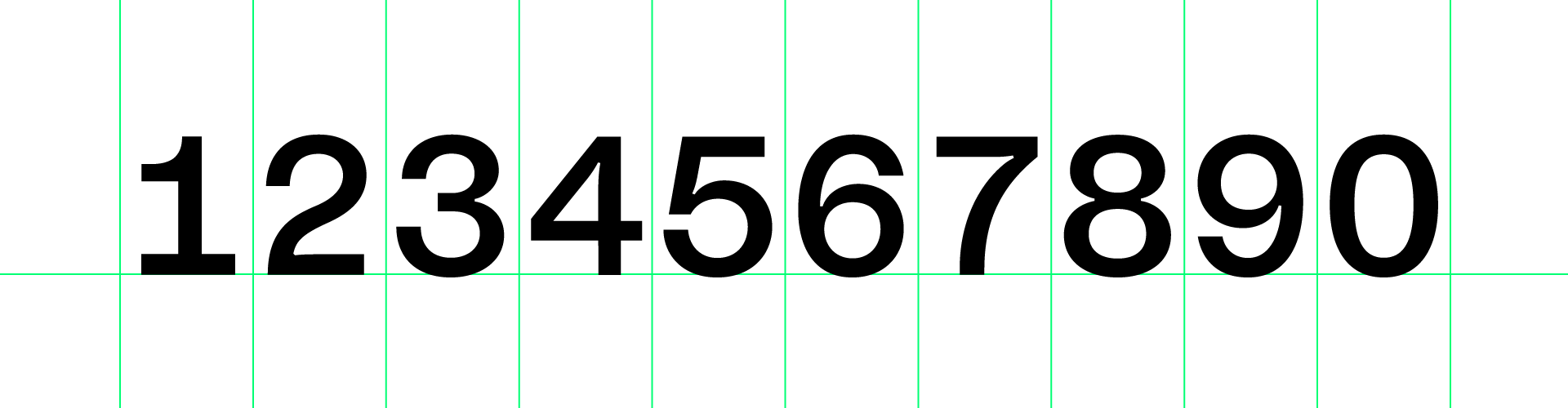
Oldstyle Figures
These figures are designed with ascenders and descenders and have features and proportions compatible with the lowercase characters of the typeface. Oldstyle figures are typically used for text settings because they blend in well with the optical flow and rhythm of the lowercase alphabet.
Tabular Figures
Tabular figures all have the same width so they align vertically. Therefore they are especially useful when setting columns of numbers, such as in financial reports.
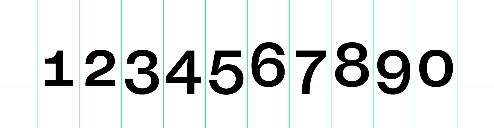
Tabular Oldstyle Figures
Same as Tabular Figures but Oldschool. Surely you can stand out with these.

Caps Figures (or Lining Figures)
These figures are designed in same alignment compatible with the uppercase characters of the typeface, they are preferred when setting certain texts, such as an all-capital headline and generally don’t fit well in lowercase text settings.

Fractions
OpenType uses numerators and denominators (also known as true-drawn superscript and subscript glyphs), separating them with the fraction bar from the font’s character set. Simply put: Just type 123/456 and you’ll see.
Desktop
- Open Illustrator
- Window
↳ Type
↳ OpenType - Select Figures
- Open InDesign
- Window
- ↳ Type & Tables
- ↳ Character
- Click ☰ ← top right
- ↳ OpenType
- ↳ Select Figures
- Open Word
- Select Text
- Press ⌘ + D
- Advanced Tab
- Number Spacing/Forms:
↳ Select Figures
Web
Option 1 (Old School):
font-variant-numeric: normal;
font-variant-numeric: slashed-zero;
font-variant-numeric: oldstyle-nums;
font-variant-numeric: tabular-nums;
font-variant-numeric: oldstyle-nums tabular-nums;
Option 2 (New School):
font-feature-settings: "lnum"; /* Lining */
font-feature-settings: "zero"; /* Slashed Zero */
font-feature-settings: "onum"; /* Oldstyle */
font-feature-settings: "tnum"; /* Tabular */
font-feature-settings: "onum", "tnum"; /* Tabular Oldstyle */
OpenType – Figure Styles typenetwork.com
font-variant-numeric CSS-Tricks
Finding Glyphs
Finding Glyphs
Can’t find a specific Glyph? The following tools give you access to glyphs you cannot access from your keyboard.
- Open Illustrator
- Type
↳ Glyphs
- Open InDesign
- Type
↳ Glyphs
- Open Word
- Insert
↳ Advanced Symbol

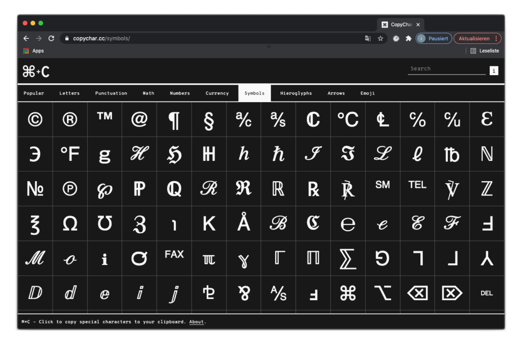
copychar.cc
A simple website that allows you to find and copy special characters to your clipboard. Click or tap on a character and it will be copied to your clipboard. Visit: copychar.cc
| ➀ | ➁ | ➂ | ➃ | ➄ | ➅ | ➆ | ➇ | ➈ | ➉ |
| ➊ | ➋ | ➌ | ➍ | ➎ | ➏ | ➐ | ➑ | ➒ | ➓ |
| ↑ | ↗ | → | ↘ | ↓ | ↙ | ← | ↖ | ↔ | ↕ |
| ○ | ✓ | © | ® | ☮ | ℗ | ○ |
Copy and Paste
Here are some useful Glyphs of the Studio Feixen Sans.
Code
Embedding Font
- Upload all the fonts to your webs server’s public directory.
For example:
www.yourdomain.com/css/webfont/ - Copy paste the code below to your .css file. Make sure you adjust the paths in code to reflect the relative path on your server. For this example you need to prepend /css/webfont/ to all src url definitions.
@font-face {
	font-family: 'NoiGrotesk-SemiBold';
	src: url('NoiGrotesk-SemiBold.eot');
	src: url('NoiGrotesk-SemiBold.eot') format('embedded-opentype'),
         url('NoiGrotesk-SemiBold.woff2') format('woff2'),
         url('NoiGrotesk-SemiBold') format('woff'),
         url('NoiGrotesk-SemiBold.ttf') format('truetype');
}
html {
font-family: 'NoiGrotesk-SemiBold', Helvetica, Arial, sans-serif;
}Embedding Variable Font
- Upload all the fonts to your webs server’s public directory.
For example:
www.yourdomain.com/css/webfont/ - Copy paste the code below to your .css file. Make sure you adjust the paths in code to reflect the relative path on your server. For this example you need to prepend /css/webfont/ to all src url definitions.
@font-face {
  font-family: 'NoiGrotesk-Variable';
  src: url(NoiVariableFlexGX.ttf) format("woff2-variations");
       /* for older browsers */
       font-weight: 500;
       font-style: normal;
}
html {
font-family: 'NoiGrotesk-Variable', Helvetica, Arial, sans-serif;
font-variation-settings: 'wght' 500, 'ital' 0;
}- Below you can find the values of our predefined font-weights.
| Noi Grotesk | ‘wght’ (Weight) | ‘ital’ (Italic = 10) |
|---|---|---|
| Black | 900 | 0 – 10 |
| Bold | 750 | 0 – 10 |
| Semibold | 600 | 0 – 10 |
| Medium | 500 | 0 – 10 |
| Regular | 400 | 0 – 10 |
| Light | 300 | 0 – 10 |
| Ultralight | 200 | 0 – 10 |
| Thin | 100 | 0 – 10 |
letter-spacing
Letter-Spacing
«Letter-spacing is about adding and removing space between letters. Some people confuse it with kerning, but these two are different; letter-spacing affects the whole line of text, whereas kerning adjusts the space between two individual letters at the time.
The main purpose of letter-spacing is to improve the legibility and readability of the text. Words act differently depending on their size, color, and the background they are on. By adjusting letter-spacing to the environment you will help readers consume your information faster, and more efficiently.»
We recommend to use letter-spacing and word-spacing depending on the font-size to improve readability and style.
p {
	font-size: 14px;
	line-height: 18px;
	letter-spacing: 0.25px;
	word-spacing: 0.1px;
	font-feature-settings: "calt" on; /* prevents deactivation */
}
letter-spacing Webdesignerdepot.com
letter-spacing and more css-tricks.com
The Type System material.io
Animation: Hover Button
.variable-button {
	font-family: 'noi-grotesk-fix';
	transition: font-variation-settings 0.5s ease;
	font-variation-settings: 'wght' 100;
}

.variable-button:hover {
	font-variation-settings: 'wght' 900;
}
<a class="variable-button">Button</a>Animation: Keyframe
.variable-animation {
	font-family: 'noi-grotesk-fix';
	font-variation-settings: 'wght' 100, 'ital' 0;;
	animation: example 4s infinite;
}

@keyframes example {
	0%   {font-variation-settings: 'wght' 100, 'ital' 0;}
	50%  {font-variation-settings: 'wght' 900 'ital' 10;}
	100% {font-variation-settings: 'wght' 100, 'ital' 0;}
}
<div class="variable-animation">Animation</div>Animation: Easing
.variable-animation {
	font-family: 'noi-grotesk-fix';
	font-variation-settings: 'wght' 900, 'ital' 0;;
	animation: example 0.5s ease infinite; /* choose easing */
}

@keyframes example {
	0%   {font-variation-settings: 'wght' 900, 'ital' 0;}
	50%  {font-variation-settings: 'wght' 100 'ital' 0;}
	100% {font-variation-settings: 'wght' 900, 'ital' 0;}
}
<div class="variable-animation">Blink</div>Problem-Solving
Cleaning Font Cache
- Uninstall all Studio Feixen Fonts.
- Open up your Terminal.app (you can find it in /Applications/Utilities/)
- Type (or copy and paste) the following commands: If you type them, each line must be finished by pressing the Return key; if you paste them, you may need to press Return to confirm the entry of the third line. The first code line will prompt you for your password. Attention: you will not see ‘passphrase bullets’ (•••) indicating the password length. Type it anyway and confirm by pressing the Return key.
sudo atsutil databases -remove
atsutil server -shutdown
atsutil server -ping- Restart your Mac.
No, really, open the Apple menu in the top left corner and choose Restart. Don’t think you can get away without a restart, otherwise the trouble will reappear. And you really do not want that, do you? OK, restart your Mac.
Updates
Here we keep you updated about all changes, bug fixes, new features, etc. All updates of our fonts are free for all our customers no matter when you bought our fonts. Sign in your account to find the most recent version of your purchases.
| Mov Variable | ||
|---|---|---|
| 2025 Mai | Version 1.0 | – Font Release |
| Ease | ||
|---|---|---|
| 2025 September | Version 1.1 | – Microsoft Office Improvements – Superior/Inferior Numbers Improved – German quotes Fixed |
| 2023 December | Version 1.0 | – Font Release |
| Studio Feixen Sans | ||
|---|---|---|
| 2025 September | Version 2.3 | – Microsoft Office Improvements – Superior/Inferior Numbers Improved |
| 2024 October | Version 2.2 (Edgy only) | – Automatic rf to rt swap removed |
| 2022 October | Version 2.0 | – New: Ultralight, Light, Semibold – New: Sans Italics – New: Monospaced Sans – New: Redesigned Edgy – Kerning Improvements – Improvements (Web Display) – Addition of Polish Diacritics – Addition of OpenType Features – New Alternates (y,g) – Case Sensitive Forms – Contextual Alternates – Discretionary Ligatures – Optical Corrections |
| 2021 March | Version 1.003 | – Polished Polish – Tabular Numbers – Wor(l)d Problems fixed |
| 2019 October | Version 1.0 | – Font Release |
| Noi Grotesk | ||
|---|---|---|
| 2025 September | Version 2.5 | – Microsoft Office Improvements – Superior/Inferior Numbers Improved |
| 2025 May | Version 2.4 | – Tabular Numbers Improved |
| 2025 February | Version 2.3 | – Fixed Windows Problems |
| 2023 March | Version 2.2 (Variable) | – Printing Problems Fixed |
| 2023 February | Version 2.1 | – Added nbsp; – Added Word Joiner – Fixed Superior and Inferior Numbers |
| 2022 March | Version 2.0 | – Additional Creamy Alternates – Greek Language Support – Cyrillic Language Support – Improvements (Web Display) – Double Storey g – Greek Phi – Spacing (optimised for text) – Optical Corrections (Various Letters) – Improvements of letter variations |
| 2021 March | Version 1.0 | – Font Release |